Identity Guidelines
January 2024
Palette
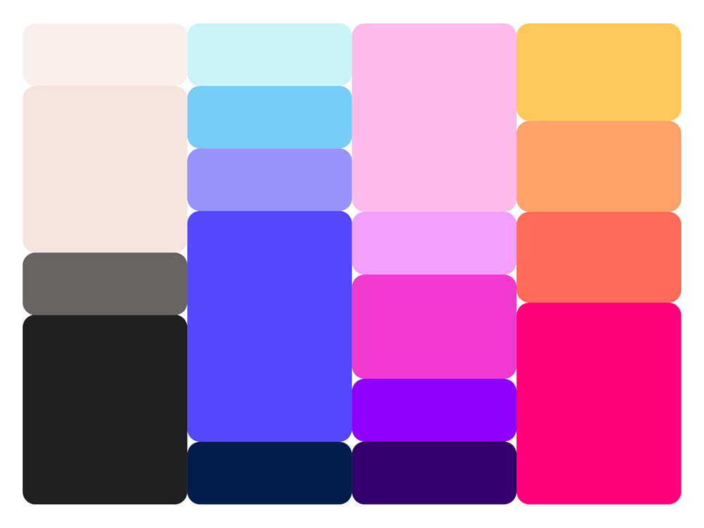
Our reimagined color palette, inspired by nature's spectrum, is a bold embrace of the vibrant and the serene. Bright, attention-commanding hues stand alongside calming neutrals, ensuring our brand vibrates with life and balance. This selection isn't just visual — it's visceral, crafted to evoke emotion and connection. Each color, chosen for its power to resonate and reflect our attitude, is integral to a brand experience that's unforgettable and deeply human.
This fresh color palette is intended to be a dynamic playground of possibilities, not just a static aesthetic choice. These hues will adapt across mediums, maintaining a cohesive identity while flexibly expressing our brand's vibrancy, warmth, and confidence. Our colors do more than stand out; they embody our energy and vision, harmonizing with the world while highlighting our unique place within it.
Color combinations
When creating designs, layouts, documents or any other type of content, the following color combinations and ratios of the Motivf color palette can be used.
Master combination
Light
Master combination
Dark
Ocean Swim
Midnight Hour
Summer Haze
Sunset
Shock Value
(a)
Shock Value
(b)
Shock Value
(c)
Shock Value
(d)
Color Groups
When you are uncertain about how to use a set of colors, follow these four following color groups for different uses internally and externally at Motivf.
Water — Business Development (Marketing, Lead Generation, & Lead Conversion)
Sky — Delivery (Client Work and R&D Work) — although some clients may require use of the Earth (Money) Color Group below.
Fire — People (Learning & Development, People Documentation)
Earth — Money (Invoicing, Billing, Etc.)
Color Don’t’s
Human and reductive, the Motivf color palette represent a choice of swatches that channel the intersections of where the natural world and humanity meet.
Don’t use low contrast combinations
Don’t use low contrast combinations
Don’t use low contrast combinations
Explore the Motivf brand world
Logo

Icon
Story
Voice
Color
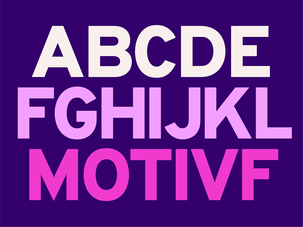
Typography

Imagery
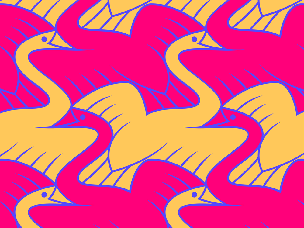
Pattern
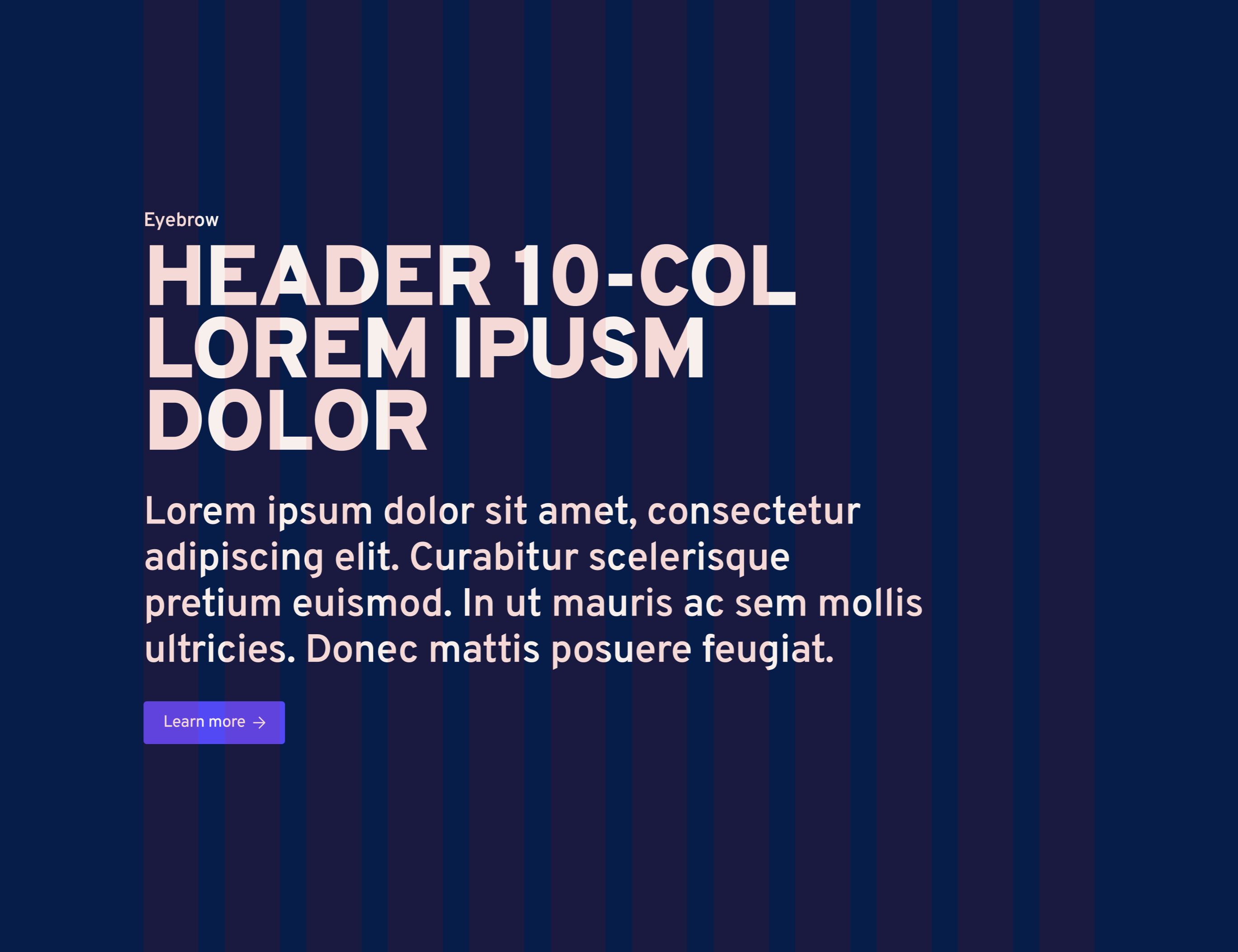
Website
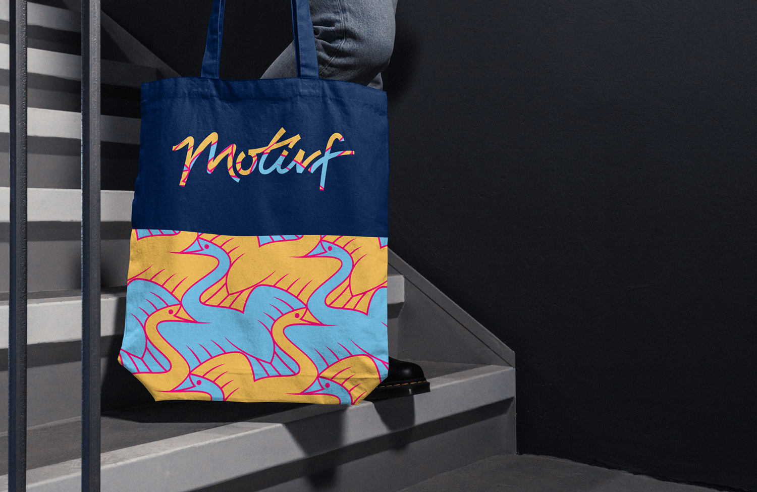
Applications