Identity Guidelines
January 2024
Typography
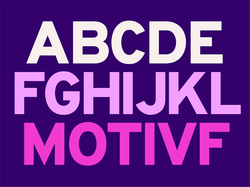
Well set type determines how we bring our written language to life. It demonstrates our personality and the clarity of our message and our new brand typeface, Overpass, is a testament to our dedication to clear, user-friendly communication.
Overpass is crafted for quick comprehension, mirroring our commitment to efficiency and clarity. It's a font that transcends borders, embodying our inclusive approach and adaptability across cultures. In every letter,
Reflecting our commitment to transparency and simplicity, this typeface underlines our pledge to an open, clear, human-centered approach in every interaction.
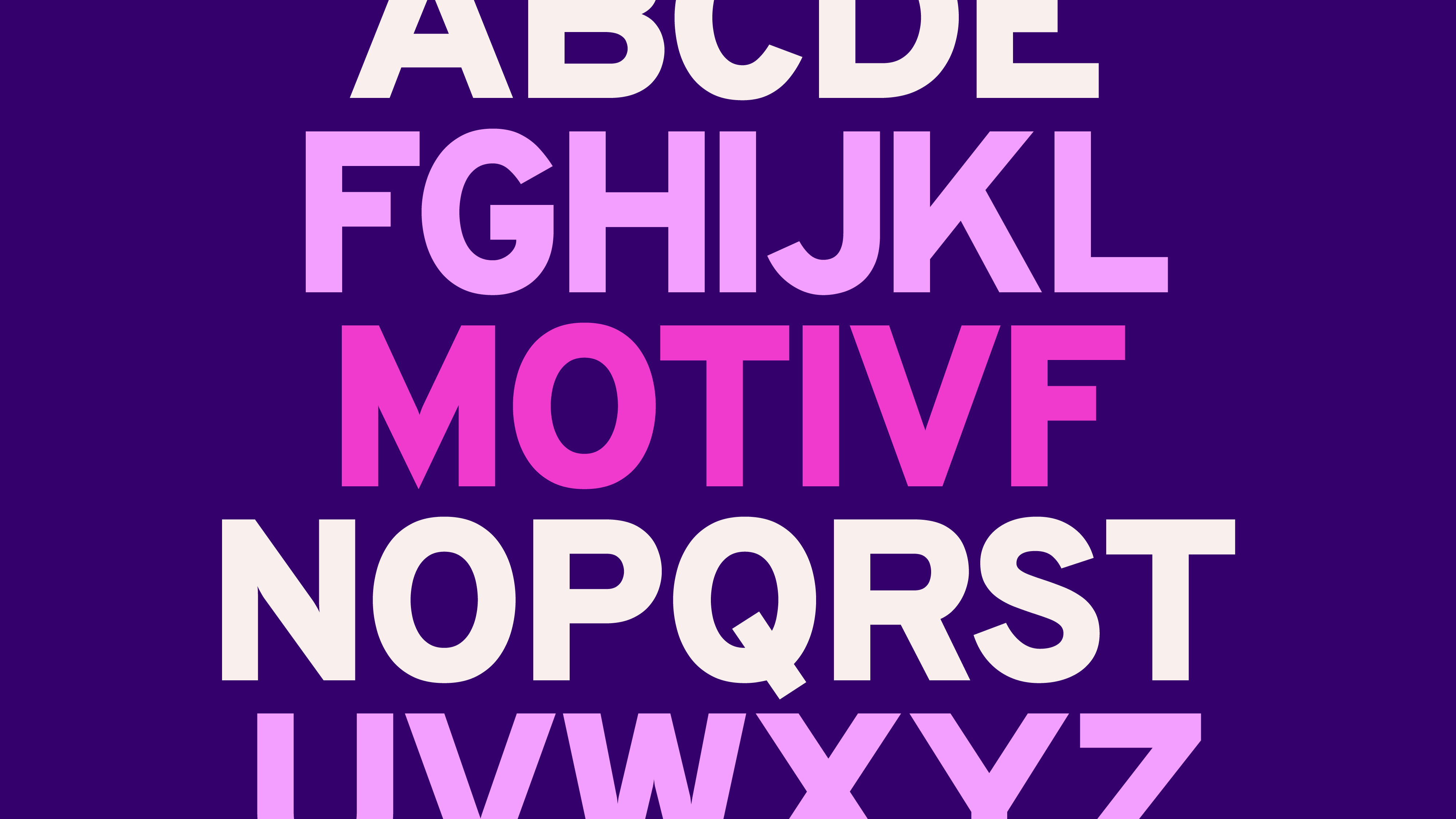
Overpass
We use it throughout all Motivf marketing communications. Whenever we present ourselves this is our primary typefaces to be used in headlines, subheadings and body copy.
Headlines, subheaders and body
While we can use different weights of the Overpass family, its power comes in measured usage. Below we detail the three main weights to be used:
Black for headlines
Semibold for subheaders
Regular for body copy
Along with the typographic settings to achieve legibility, consistency and readability. Click on the blurple boxes to test how something looks in Overpass.
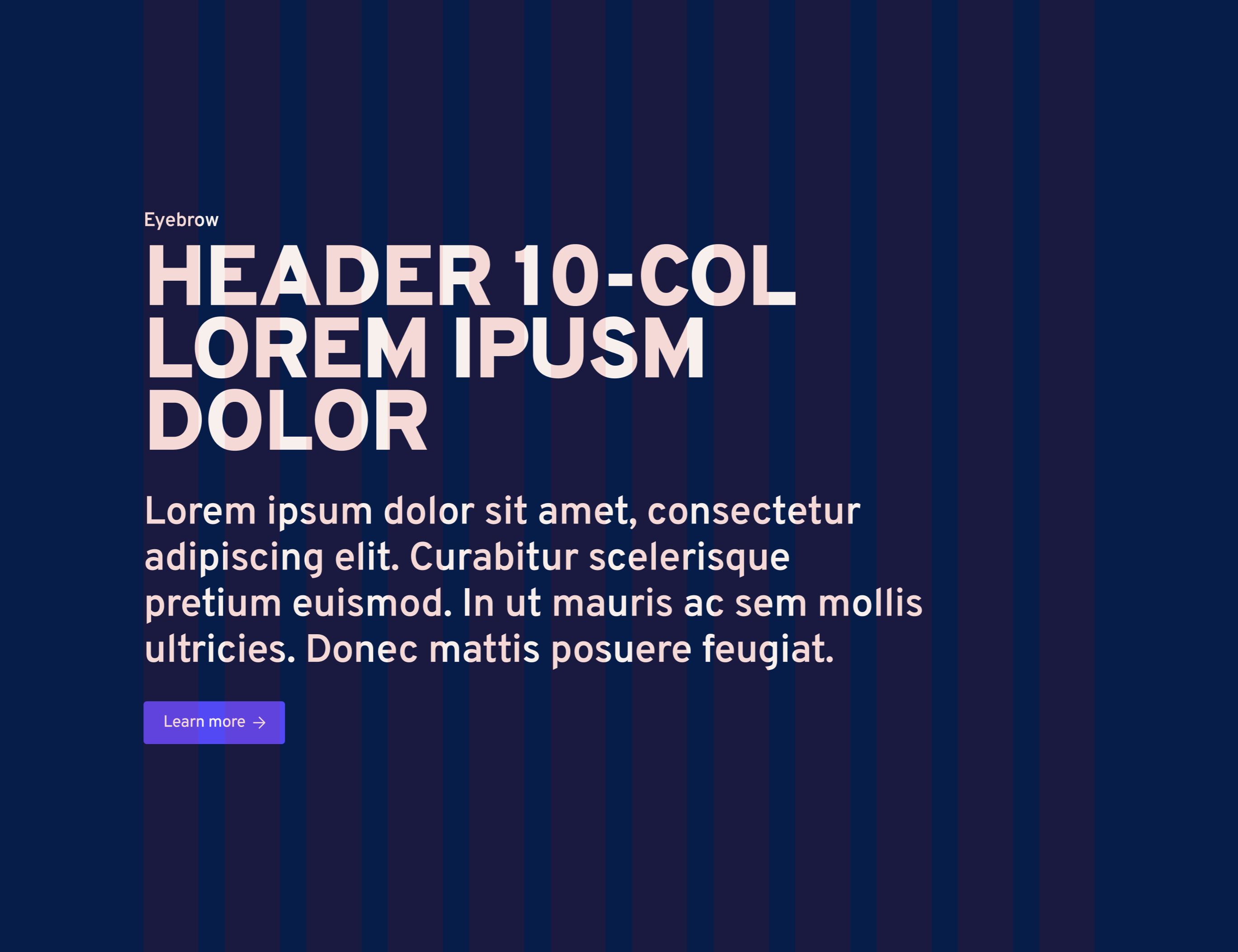
Headlines
Overpass Black
All Caps, always
Tracking: -40
Leading: 1.1x font size
Subheaders
Overpass Semibold
Title Case
Tracking: -20
Leading: 1.2x font size
Body
Overpass Regular
Sentence case
Tracking: -10
Leading: 1.4x font size
Explore the Motivf brand world
Logo

Icon

Story
Voice
Color
Typography

Imagery

Pattern
Website
Applications